
- Splurge case study examples:
Metrocoat
From first hello to lasting loyalty, we rebuilt Metrocoat's brand to create authentic and profitable relationships.
Client:
www.metrocoat.com
Services:
Content Strategy, Brand Strategy, Rebranding, Logo, Copywriting, Web Design & Development, Graphic Design, Digital Marketing, Website Maintenance & Management, Website Hosting.
Industry:
Manufacturing, B2B.
-
Our results.
Increase in client inquiries.
Website now showcases the company's products and capabilities catalog.
Search engine visibility.
The challenge.
Metrocoat Graphic Supply, LLC.,
a family-owned manufacturer based in New Jersey, has been supplying premium water-based coatings and UV varnishes to the printing industry for over a century. Despite their stellar reputation among existing industrial clients and deep expertise in pressroom consumables, their brand presence was stuck in the past. While they had built strong B2B relationships through direct sales and personalized technical support, their complete lack of digital presence meant they were invisible to procurement teams and print shop managers searching for coating solutions online.
The company's traditional approach had served them well for decades, but as B2B purchasing became increasingly digital, they risked losing market share. Their competitors were offering detailed technical specifications through online catalogs and streamlining the procurement process through digital channels. Metrocoat's commitment to quality products and technical expertise wasn't being communicated effectively to a new generation of industrial buyers who expect comprehensive product information and ordering capabilities online. They needed more than just a website – they needed a complete brand transformation that would honor their industrial heritage while modernizing their presence.
The solution.
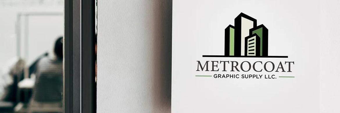
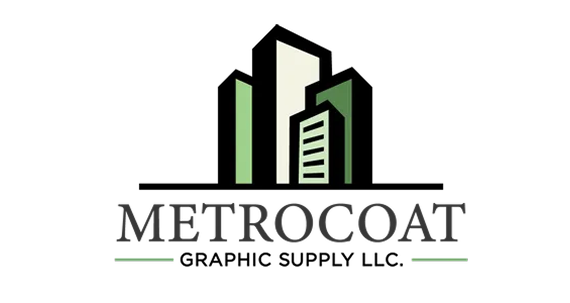
We partnered with Metrocoat's team to build a brand presence that connected their century-old legacy with modern digital needs. The refreshed logo kept familiar elements but introduced a clean, professional look that reflected their industrial expertise.
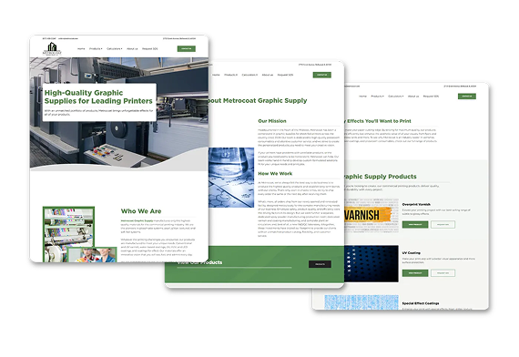
We then created a digital home that made life easier for their B2B clients. The new website includes an intuitive product catalog with detailed technical specifications, streamlined ordering processes, and clear information about their custom coating solutions. Every element was designed with their printing industry clients in mind — from easy to navigate product categories to detailed application guides.
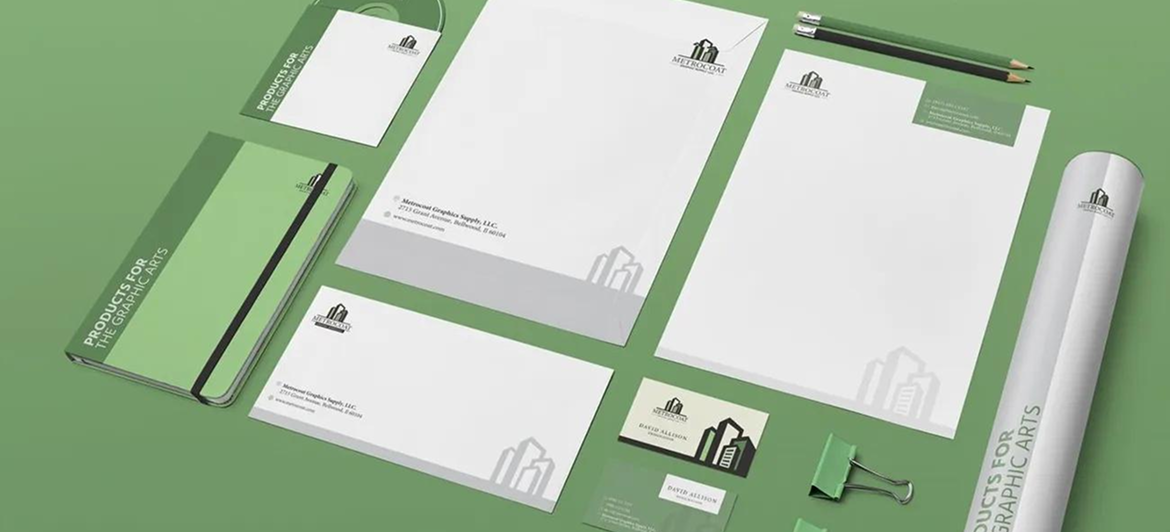
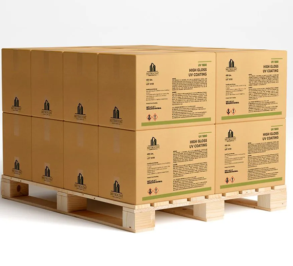
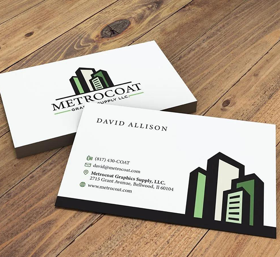
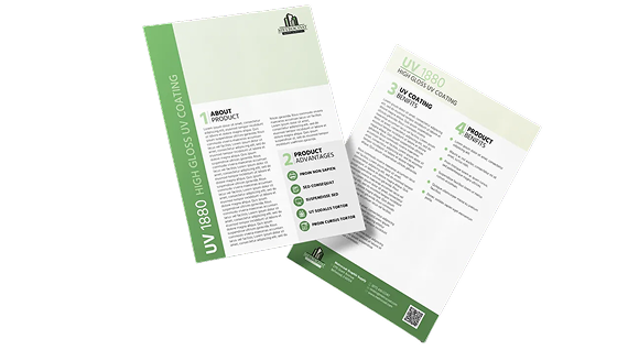
To bring everything together, we developed marketing materials that ensured consistency across every touchpoint, from business cards to product packaging. The result? A unified brand experience that maintains Metrocoat's personal touch while making it easier than ever for print shops to find and work with them.
Metrocoat's digital marketing strategy.
-
Branding & visual identity
Metrocoat needed a brand that balanced their century of expertise with modern appeal. We kept the essence of their trusted industrial identity while giving it a contemporary polish. The new design uses clean typography and bold elements that feel both established and forward-thinking, perfect for a company that's been innovating since the early 1900s. The refreshed look speaks directly to their printing industry clients while maintaining the warmth of a family-owned business.
-
Website development & digital experience
The heart of Metrocoat's new presence is their custom-built website, designed specifically for their B2B clients' needs. We created an intuitive product catalog that makes it easy to browse their extensive range of coatings and pressroom supplies. Each product page includes detailed technical specifications and application guidelines — information their clients previously had to request manually. The streamlined ordering system now allows print shops to place orders efficiently, while still maintaining the personal connection Metrocoat is known for.
-
Marketing materials
We extended the new brand look across all customer touchpoints, from product packaging to trade show materials. Their facility signage, business cards, and sales materials now work together to tell a cohesive story. Email marketing campaigns were designed to keep clients informed about new products and technical innovations. Even their shipping labels and packing slips became opportunities to reinforce their professional, quality-focused brand.
Explore our collection of success stories.


— Let's work together
Ready to work with us?
We are ready to brainstorm solutions to solve your marketing challenges. Get in touch today!