
- Splurge case study examples:
Maya's Cake Cartel
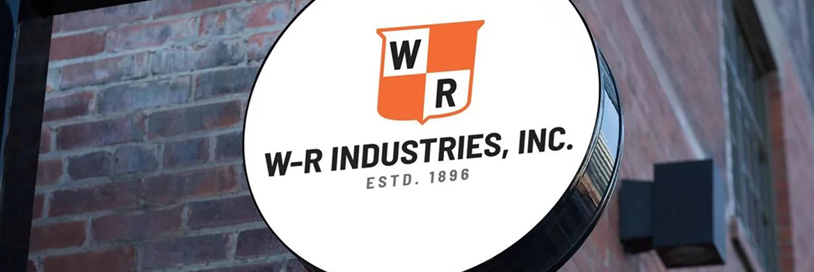
Reimagining a manufacturer of pressroom supplies with a celebrated 120+ year history to position the organization for success in this century.
Client:
www.w-rindustries.com
Services:
Content Strategy, Brand Strategy, Rebranding, Logo, Copywriting, Web Design & Development, Graphic Design, Digital Marketing, Website Maintenance & Management, Website Hosting.
Industry:
Supplies for Commercial Printing, B2B.
-
Our results.
Increase in client inquiries.
Website now showcases the company's products and capabilities catalog.
Search engine visibility.
The challenge.
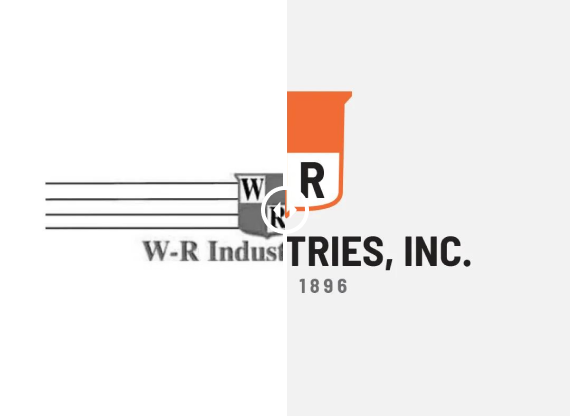
W-R Industries, Inc., a manufacturer of pressroom supplies with a rich 120-year history in the commercial printing industry, faced a pivotal moment in their life cycle. As their industry underwent a dramatic shift toward digital operations, W-R needed to adapt while preserving the brand equity they had built over a century.
The challenge was multifaceted: how to maintain their reputation for quality and reliability while modernizing their market presence? Their existing brand assets and online presence weren't equipped to showcase their capabilities in today's digital landscape, and their traditional customer base was evolving. They needed a complete transformation that would honor their past while positioning them for future success.
The solution.
We embarked on a comprehensive brand transformation that touched every aspect of W-R Industries' identity. Starting with extensive research into the commercial printing industry and their target audience, we created a new visual identity that respected their heritage while bringing fresh energy to their brand.
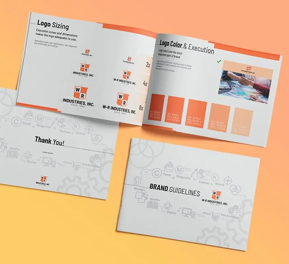
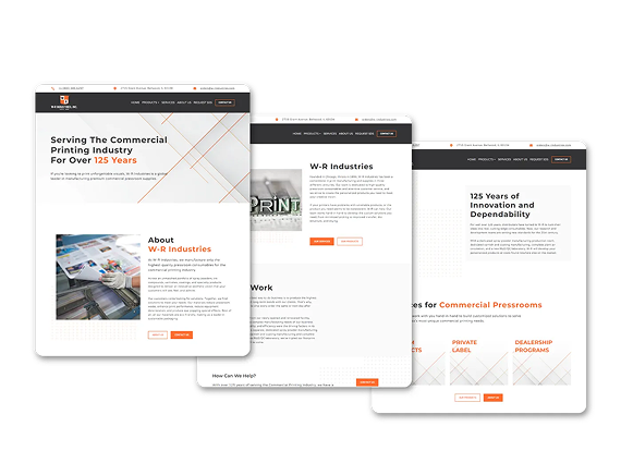
The cornerstone of this transformation was a new logo and cohesive design system that worked across both digital and physical touchpoints. We developed a robust online presence with a user friendly website featuring their product catalog and capabilities, while implementing strategic SEO practices to increase their digital visibility. This careful balance of traditional values and modern functionality helped W-R Industries maintain their trusted reputation while opening new channels for growth.
W-R Industries' marketing strategy:
- Rebranding & identity systems
We recognized that W-R Industries' strength lay in their approachable, no-nonsense business culture. Our strategy focused on translating these values into a cohesive digital experience. We redesigned their website to serve as a powerful sales tool, incorporating a comprehensive product catalog and streamlined user experience. The new platform wasn't just about looks — it provided their management team with valuable insights into web traffic and sales patterns, enabling data-driven decision making for future growth.
- Website design and development
From there, we worked with the layout and design of W-R’s online presence, starting with their webpage. We applied the new brand image and voice to their page and reformatted it to facilitate easier communication between the customer and the business. We added a product and capabilities catalog and standardized the user experience across all platforms.
We also streamlined the web experience for W-R’s management team, enabling them to track and understand how future web traffic would drive their sales. At the same time, we were careful to establish the importance of W-R’s business in the commercial printing industry by balancing its online presence with some eye-catching printed marketing materials.
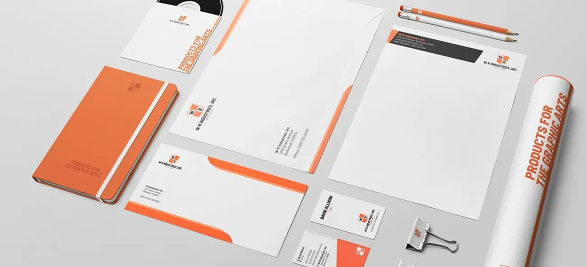
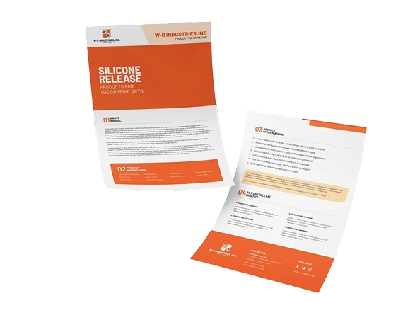
- Marketing materials
We continued to standardize the user experience with marketing materials, for both physical and digital marketing. From applying the brand to their building and meeting rooms to trade show stands, we created a more recognizable and streamlined, professional image. We also applied the new brand to all of W-R’s email and web marketing, making them more visible online.
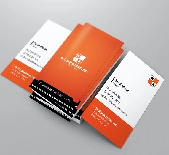
This new image permeates all parts of the business and is uniform across W-R’s new flyers, product labels, product brochures, and business cards. These details even extend to the company’s letterhead, mailing envelopes, and much more, creating a memorable and unique new brand. We used this new brand uniformity to reach W-R’s target audience: a traditional, but modernizing, customer base.
Explore our collection of success stories.

— Let's work together
Ready to work with us?
We are ready to brainstorm solutions to solve your marketing challenges. Get in touch today!