
- Splurge case study examples:
The Lawn Artisan
Cultivating a premium brand for a new, detail-oriented lawn care service.
Client:
thelawnartisan.com
Services:
Brand Strategy & Positioning, Brand Identity & Design Language, Graphic Design, Search Engine Optimization.
Industry:
Lawn Care Company
-
Our results.
Successfully launched a new premium home services brand from the ground up.
Established a distinct, professional identity that stands out in a crowded market.
Created high-quality physical marketing assets that build brand recognition in target neighborhoods.
Attracted ideal, investment-focused homeowners through hyper-local SEO.
The challenge.
The Lawn Artisan
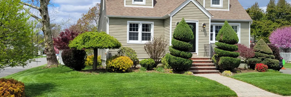
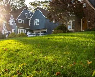
was a brand-new start-up entering the highly competitive New Jersey landscaping market. While many companies offer basic mowing and maintenance, The Lawn Artisan’s founder aimed to create a different class of service—one built on educating homeowners and providing meticulous, "white glove" care. The central challenge was to cut through the noise of established competitors and clearly communicate this unique value proposition. They needed to build a brand that instantly conveyed expertise, creativity, and premium quality, attracting clients who view their outdoor space as an extension of their home and a creative investment.
The solution.
Splurge partnered with The Lawn Artisan to build its entire brand presence from the ground up. Our goal was to create a sophisticated and trustworthy brand that would attract discerning homeowners and justify a premium service model. We developed a strategy focused on positioning The Lawn Artisan not just as a lawn care company, but as a specialized partner in overall home beautification.
How We Grew The Lawn Artisan's Presence
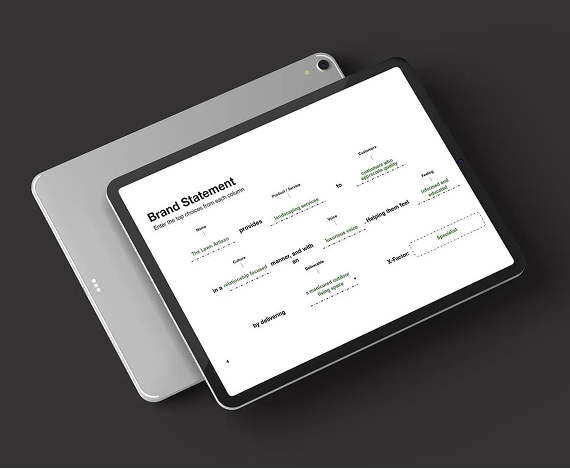
- Brand Strategy & Positioning
We began by creating a brand strategy centered on the name itself: "The Lawn Artisan." This concept guided all messaging to focus on craftsmanship, education, and customized care. We positioned the company as a specialized consultant for homeowners in affluent communities like Westfield, Cranford, and Garwood, NJ. The strategy was to move the conversation from price to value, emphasizing the long-term benefits of professional, expert-led lawn and landscape maintenance.
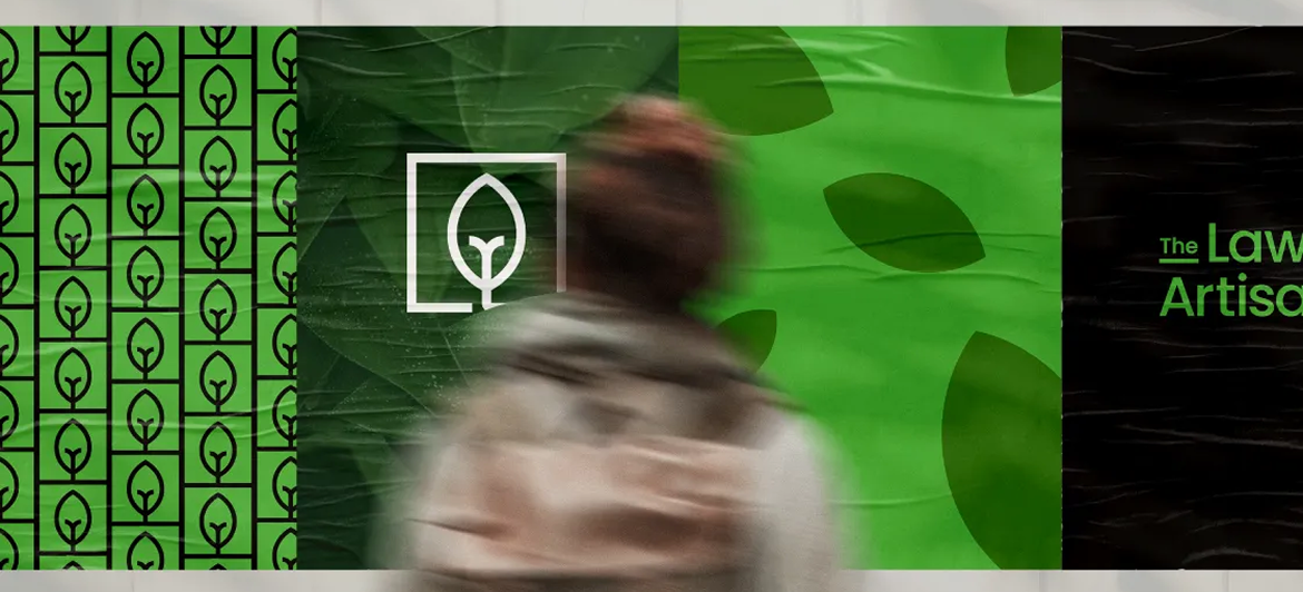
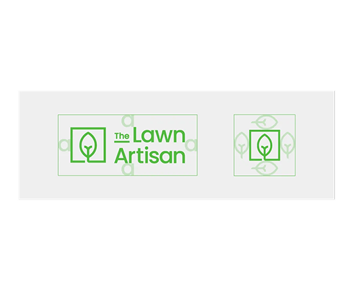
- Brand Identity & Design Language
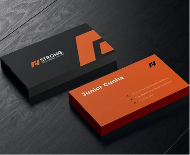
To match the premium strategy, we designed a clean, sophisticated visual identity. The logo, color scheme, and typography were chosen to evoke a sense of high-end quality and professionalism, setting The Lawn Artisan apart from the more generic look of many competitors. This design language created a cohesive and upscale brand feel that communicates trust and attention to detail.
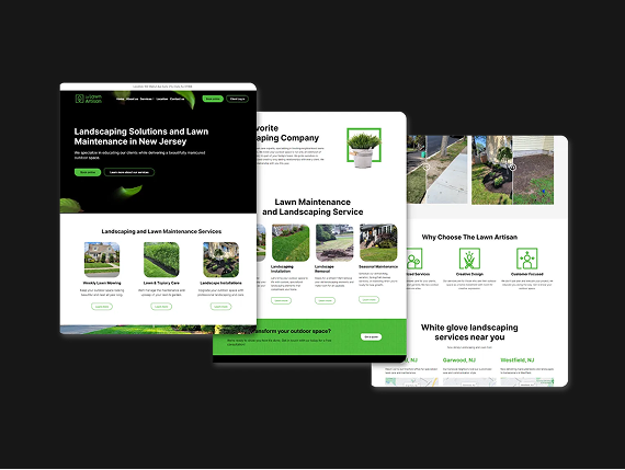
- Website Development & Design
The website serves as the digital cornerstone of the Artisan brand, so we designed and developed a custom, image-forward platform to capture their premium. The user experience is built for clarity and conversion, with intuitive navigation to their service descriptions and a prominent portfolio to showcase their craftsmanship. The result is a powerful digital hub that not only generates qualified leads but also serves as the primary platform for educating clients on how to transform, beautify, and perfect their outdoor spaces.
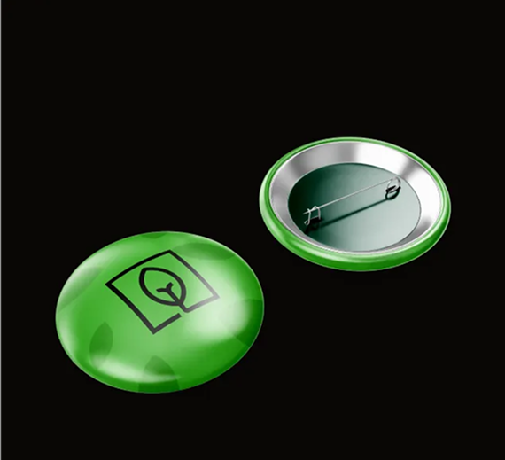
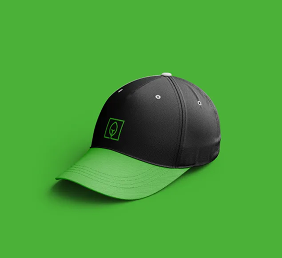
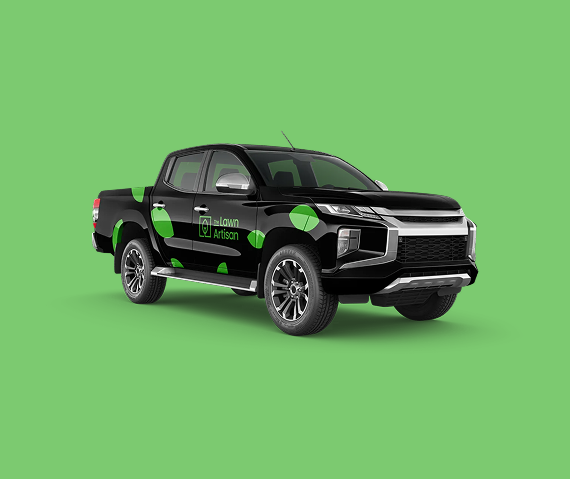
- Graphic Design
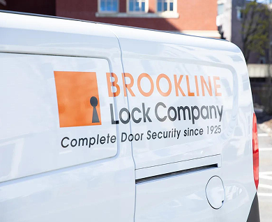
A strong local brand needs to be visible. We translated the new brand identity into a suite of professional graphic design assets. This included designing impactful truck livery that turns service vehicles into mobile billboards, creating professional lawn signs that build neighborhood credibility, and designing branded t-shirts for a unified team appearance. These tangible assets ensure that every public-facing element of the business reinforces its premium, artisan quality.
Explore our collection of success stories.
— Let's work together
Ready to work with us?
We are ready to brainstorm solutions to solve your marketing challenges. Get in touch today!